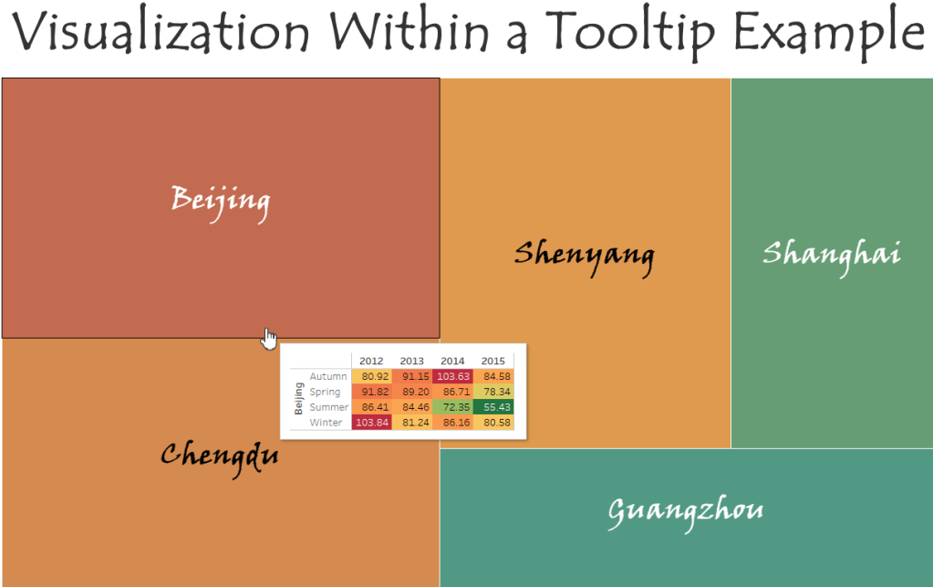
Visualizations within a tooltip are a great way to display information that is not already available on your chart. One of the great things about tooltip visualizations is that they change the information they show based on what you hovering over. This will become more apparent in the end, when we are able to move our cursor over a group in the treemap and see yearly information for just that group. In this example we will be creating our own highlight table and treemap charts, then adding the highlight table as the charts tooltip.
Please check out the Video of this Walk-Through
You can view the finished example on my tableau public account
This example was made using Tableau Desktop 2020.1
This data comes from Song Xi Chen at Peking University
You can download a copy of the data used in this example here
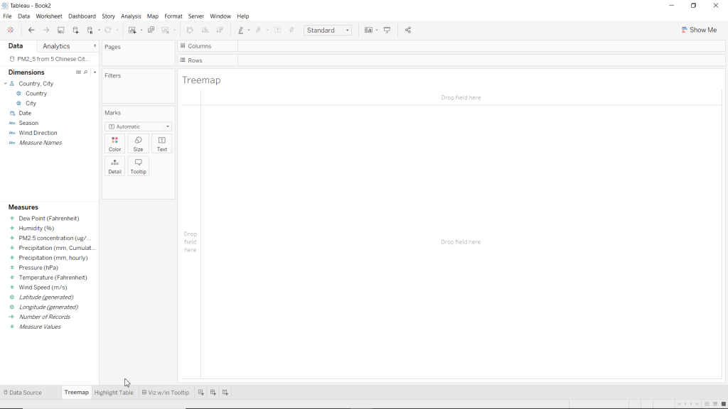
Step 1: Initial Setup
We will be using data about air pollution in 5 major Chinese cities from 2012 to 2015.
- Open Tableau Desktop
- Connect to “PM2_5 from 5 Chinese Cities from 2012 to 2015.csv”
- Rename Sheet 1 to Treemap
- Create a new blank worksheet
- Rename Sheet 2 to Highlight Table
- Save your workbook as Visualization within Tooltip Example
*Note: Please excuse the dashboard in this screenshot, it is from a rough draft of this blog post.
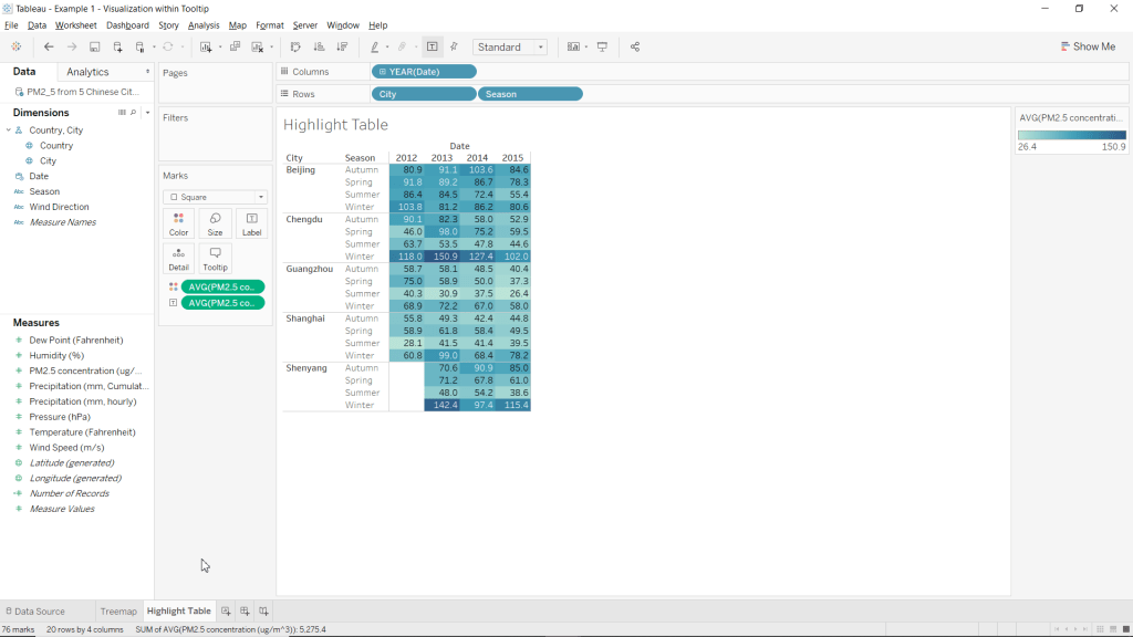
Step 2: Create Highlight Table
Our highlight table is what we will use as our visualization within the tooltip. Granted, these are not cool distributions or charts, but remember that the main purpose for adding visualizations within tooltips is to provide your clients with additional information that they are not already receiving from the chart on its own.
- Go to the Highlight Table worksheet
- Drag PM2.5 concentration (ug/m^3) over to the Color mark.
- Change the color of PM2.5 concentration (ug/m^3) from sum to average
- Right click the SUM(PM2.5 concentration (ug/m^3)) pill in the Marks card
- Highlight Measure (Sum)
- Select Average
- Drag PM2.5 concentration (ug/m^3) over to the Label mark.
- Change the label of PM2.5 concentration (ug/m^3) from sum to average
- Right click the SUM(PM2.5 concentration (ug/m^3)) pill in the Marks card
- Highlight Measure (Sum)
- Select Average
- Drag Date to Columns
- Drag City to Rows
- Drag Season to Rows
- Change the Marks type to Square
- Locate the Marks card
- Click the drop-down menu at the top of the Marks card (it should say Automatic)
- Select Square
Congrats, you have just created a Highlight Table without using the Show Me menu!
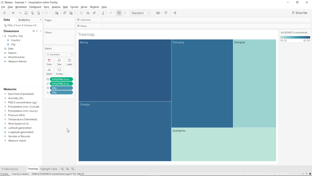
Step 3: Create Treemap Chart
You can use visualizations within tooltips on any chart you want, with whatever charts or tables you want. For this example, we will be demonstrating this cool feature in Tableau using a treemap chart.
Congratulations, you have just created a Treemap Chart without using the Show Me menu!
Step 4: Adding the Visualization to the Charts Tooltip
Now that we have created our data visualization (treemap) and additional information to display (highlight table) we are now ready to bring it all together and add the table to our charts tooltip.
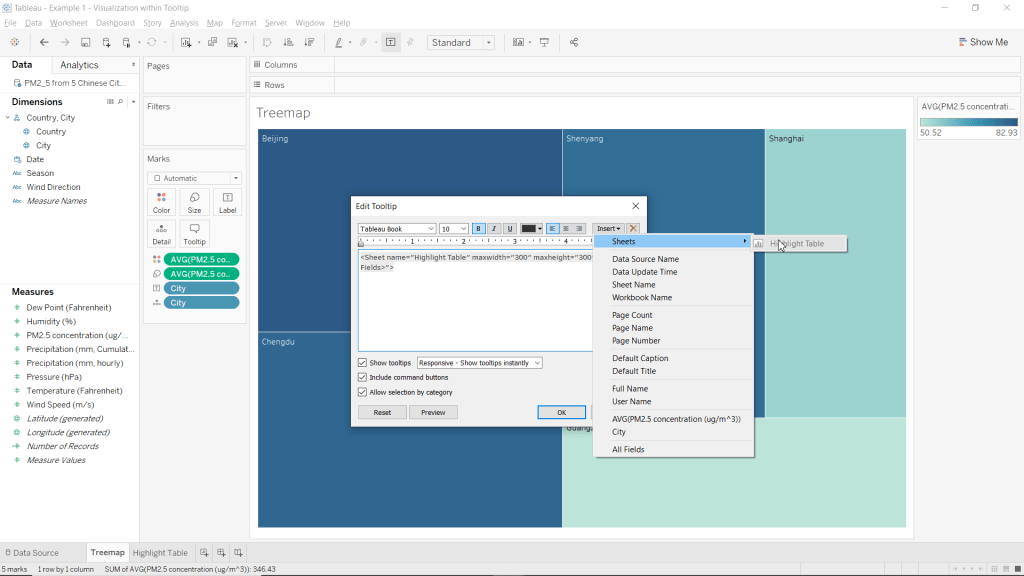
- Click the Tooltip mark
- Clear the text
- Insert a sheet into your tooltip
- Click Insert (in the top-right corner of the Edit Tooltip window
- Highlight Sheets
- Select Highlight Table
- Click OK
Congrats, you have just added a visualization to your charts tooltip! Now when you hover over (or select) any of the sections of the treemap, you will see information about that city in the tooltip from the highlight table!
Step 5: Formatting
At this point you have accomplished your initial goal, but the default colour scheme just leaves something to be desired. From here everything is optional, but I will show you how to format your chart to look similar to my example.
- Go to the Highlight Table worksheet
- Hide the Title
- Right-click on Highlight Table in the top left corner of the worksheet
- Select Hide Title
- Hide Date column header
- Right click Date (above 2013 and 2014 in the worksheet view)
- Select Hide Field Labels for Columns

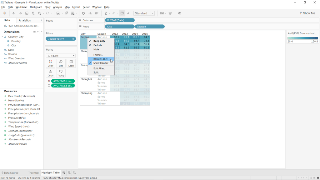
- Rotate City labels
- Right-click anywhere below City (in the table)
- Select Rotate Label
- Change the color scheme of the chart to Red-Green-Gold Diverging reversed.
- Click the Color mark
- Select Edit Colors…
- Click the drop-down menu under Pallette:
- Choose Red-Green-Gold Diverging
- Select Reversed
- Click OK

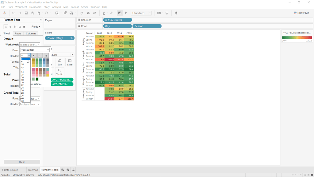
- Change the worksheets font-size to 8.
- Right-click on any of the cells within the table (below the dates and right of cities/season)
- Select Format
- Click the drop-down menu next to Worksheet:
- Click the drop-down menu for font-size (should be a 9 by default)
- Select 8.
- Close the Format pane.
- Manually adjust the tables column width to be as small as possible.
- Position your cursor inbetween the cells for each individual year until your cusor becomes a horizontal double-arrow. Such as in the picture below
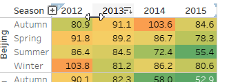
- Remove extra blank space from each column by clicking, holding, and moving the cursor left.
- Position your cursor on the line between seasons and the tables data until your cursor becomes a horizontal double-arrow.
- Remove extra whitespace from the seasons column
- Note: This step is to allow this table to fit within the tooltip of your chart.
- Go to the Treemap worksheet
- Change the color scheme of the chart to Temperature Diverging reversed.
- Click the Color mark
- Select Edit Colors…
- Click the drop-down menu under Pallette:
- Choose Temperature Diverging
- Click OK
- Change Font to Viner Hand ITC
- Set Font-size to 28
- Set Charts text alignment to be middle center.
- Click the Label mark
- Use the drop-down menu next to Font: to change the font and size.
- Use the drop-down menu next to Alignment: to change the vertical and horizontal alignments to Center.

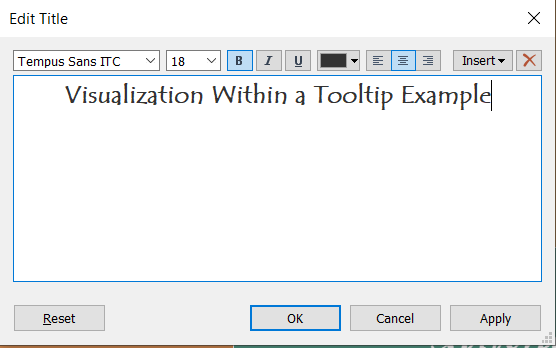
- Set the Title text to “Visualization Within a Tooltip Example”.
- Set Title Font to Tempus Sans ITC.
- Set Title Font-Size to 18.
- Bold the Titles text.
- Center Align the Titles text.
- Right click the title
- Select Edit Title…
Congratulations!! You have just added a visualization to your charts tooltip! Now when you hover over (or select) any of the sections of the treemap, you will see information about that city in the tooltip from the highlight table!
You can view this example in a working dashboard I made about the PM2.5 Concentrations across 5 Chinese Cities from 2012 to 2015
Please follow me on social media:
YouTube
Reddit
Tableau Public Profile
My Personal Blog
JoshuaPaulBarnard.com

Leave a comment