This fun little visualization is the first chart that I genuinely discovered on my own, allowing us to graph the distribution of a single measure or of two measures compared to each other, and then adjust the colors within the distribution graph. That is because it is actually made up from an accumulation of squares, which can have dynamic color schemes added to them. You can also use this visualization to easily filter and page through your data to view a breakdown of your distributions. To make this visualization, we will be making a bar chart using a single measure, then expanding to using two measures, then paging our data by year using the date dimension.
You can view the Video of this walk-through, but I recommend reading through the steps first before watching the video guide.
In our example we will be using data from Peking University on PM2.5 concentrations in the air of 5 major Chinese cities from 2012 to 2015.
The original data comes from Song Xi Chen at Peking University
This example was made using Tableau Desktop 2020.1
Step 1: Initial Setup
First things first we will connect to our data, create our worksheets and save the Tableau workbook as Distribution Map Example
- Connect to “PM2_5 from 5 Chinese Cities from 2012 to 2015.csv”
- Open Tableau Desktop
- Select Text File
- Navigate to your files location
- Select PM2_5 from 5 Chinese Cities from 2012 to 2015.csv
- Rename Sheet 1 to Single Measure
- Right-click the Sheet 1 worksheet tab in the bottom left corner of the screen
- Select Rename
- Type Single Measure
- Press the Enter key
- Create a new blank worksheet and rename it to Two Measures
- Click Worksheet in the menu bar
- Select New Worksheet
- Right-click the Sheet 2 worksheet tab in the bottom left corner of the screen
- Rename Sheet 2 to Two Measures
- Press the Enter key
- Make the Single Measure worksheet active
- Click the Single Measure worksheet tab in the bottom left corner of the screen
- Save your workbook as Distribution Map Example
- Click File in the menu bar
- Select Save As…
- Type Distribution Map Example
- Navigate to where you want to save the project
- Click Save

Step 2: Creating Single Measure Distribution Map
We will now create our first distribution map using a single variable. For comparison, create a bin of size 27 from the PM2.5 concentration (ug/m^3) measure and place it in the columns instead.
- Drag PM2.5 concentration (ug/m^3) over to Rows.
- Drag PM2.5 concentration (ug/m^3) over to Columns.
- Turn off Aggregate Measures
- Click Analysis in the menu bar
- Select Aggregate Measures
- Change the Marks type to Bar
- Locate the Marks card
- Click the drop-down menu at the top of the Marks card (it should say Automatic)
- Select Bar
Congratulations! You have just made a Distribution Map for a single variable.

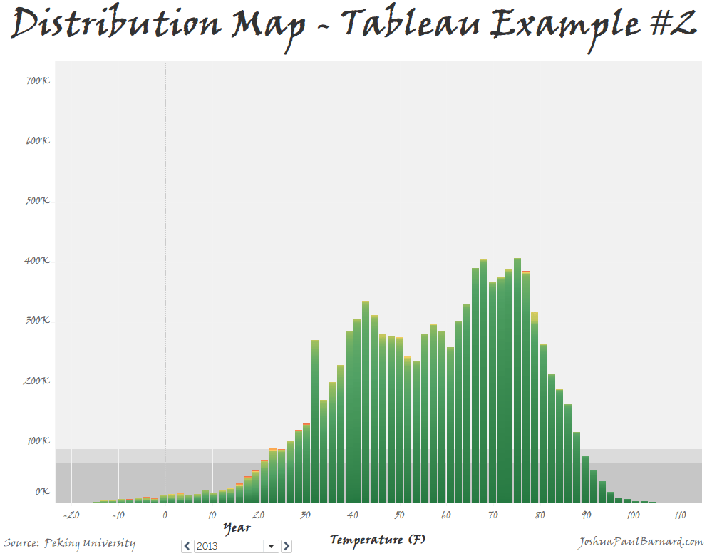
Step 3: Creating Distribution Map Comparing Two Measures
Now we can use the same basic method to create our chart comparing the distribution between two different measures. As you may have noticed by now, the real magic here lies in not aggregating our measures, so we are comparing each individual data point to each other.
- Drag PM2.5 concentration (ug/m^3) over to Rows.
- Drag Temperature (Fahrenheit) over to Columns.
- Turn off Aggregate Measures
- Click Analysis in the menu bar
- Select Aggregate Measures
- Change the Marks type to Bar
- Locate the Marks card
- Click the drop-down menu at the top of the Marks card (it should say Automatic)
- Select Bar
Congratulations! You have just made a Distribution Map for comparing two measures.

Step 4: Paging and Formatting
Now that we have created our distribution maps, we will now look into colouring them then paging through the data by a Dimension field. In this example our dynamic colouring will be purely for aesthetics, but this feature can be used to help highlight extremes in the distribution. Paging by a dimension such as date allows us to make sure that the distribution for each group which we are analyzing has a proper distribution.
- Drag PM2.5 concentration (ug/m^3) over to the Color mark.
- Change the color scheme of the chart to Red-Green-Gold Diverging reversed.
- Click the Color mark
- Select Edit Colors…
- Click the drop-down menu under Pallette:
- Choose Red-Green-Gold Diverging
- Select Reversed
- Click OK
- Drag Date from Dimensions to the Pages card.
- Change Worksheet Title to Distribution Map Example.
- Right click the current Title (it should say: Two Measures – 2012)
- Select Edit Title…
- Clear the current text
- Turn on Bold
- Center Align Text
- Type: Distribution Map Example
Congratulations! You have just formatted your new Distribution Map and can now page it by year!
You can check out how I used this example in a working dashboard about the PM2.5 Concentrations across 5 Chinese Cities from 2012 to 2015.

Please follow me on social media:
YouTube
Reddit
Tableau Public Profile
My Personal Blog
JoshuaPaulBarnard.com

Leave a comment