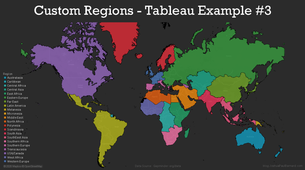
In this example we will demonstrate how to create our own custom regions (territories) with groups of data which are not provided by Tableau’s robust geographic engine. Creating custom regions is very useful for visualizing information about regions relevant to your analysis, such as counties within a state or countries within a continent. Not only does Tableau allow us to visualize these custom regions, but we can also do calculations using these regions as groups. In this example we will be using our custom coded data from our the previous tutorial. In this example we will create two separate maps, the first map will show the individual countries grouped by their continent by colour, and the second map will only show our custom regions using the data from each country (and is the cover image for this example).
To create custom regions in Tableau you must code the region information into your data manually, and I covered how to do this in the previous post Creating Custom Regions with Large Data Sets – Tableau Prep Example #1. If you want to do not want or need to learn how to manually code this type of data to a large dataset, then you can download the finished dataset ready to use as a .csv (instead of .hyper).
You can view the Video of this walk-through, but I recommend reading through the steps first before watching the video guide.
In our example we will be using data from Gapminder.org and you can download the data here.
This example was made using Tableau Desktop 2020.1
Step 1: Initial Setup
If you are following along my previous post
- Connect to Custom Regions Tableau Example.hyper (or .csv)
- Optional: Download Custom Regions Tableau Example.csv
- Open Tableau Desktop
- Click File in the menu bar
- Select Open…
- Navigate to your files location
- Select Custom Regions Tableau Example.hyper (or .csv)
- Click Open
- Rename Sheet 1 to Continent
- Right-click the Sheet 1 worksheet tab in the bottom left corner of the screen
- Select Rename
- Type Continent
- Press the Enter key
- Create a new blank worksheet and rename it to Custom Regions
- Click Worksheet in the menu bar
- Select New Worksheet
- Right-click the Sheet 2 worksheet tab in the bottom left corner of the screen
- Rename Sheet 2 to Custom Regions
- Press the Enter key
- Save your workbook as Custom Regions Example
- Click File in the menu bar
- Select Save As…
- Type Custom Regions Example
- Navigate to where you want to save the project
- Click Save
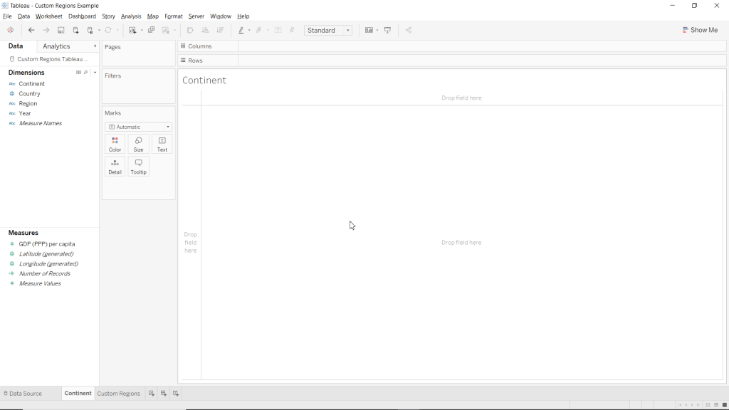
Step 2: Create Map showing Countries within Continents
Now we are going to use our custom coded variables to create a map of the world’s countries grouped by colour by which continent they are in.
- Make the Continent worksheet active
- Drag Latitude (generated) to Rows
- Drag Longitude (generated) to Columns
- Drag Country to the Detail mark
- Drag Continent to the Color mark
- Change the Marks type to Map
- Click Automatic in the drop-down menu at the top of the Marks card
- Select Map
Now you just created a filled map chart with custom regions without using the Show Me menu! This is a great way to show information about the individual countries while showing their affiliation to a larger group.

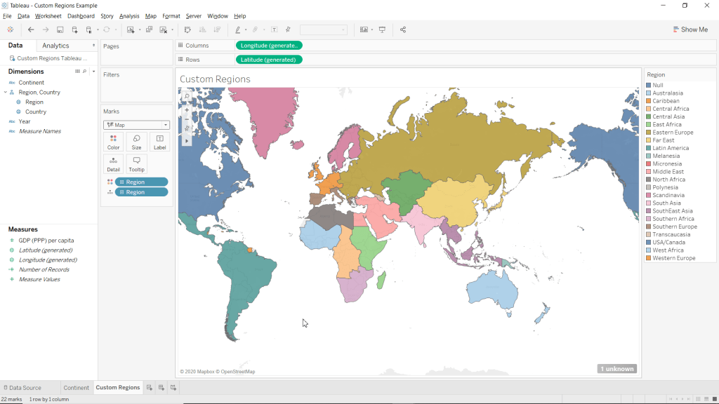
Step 3: Create Map of World’s Continents
We are now going to use custom coded regions and hierarchies to create a map of the for our custom regions.
- Make the Custom Regions worksheet active
- Change Region to a geographic role
- Right-click Region (under Dimensions)
- Highlight Geographic Role
- Highlight Create from
- Select Country
- Drag Latitude (generated) to Rows
- Drag Longitude (generated) to Columns
- Drag Region to the Detail mark
- Drag Region to the Color mark
- Select Add all members
- Change the Marks type to Map
- Click Automatic in the drop-down menu at the top of the Marks card
- Select Map
Now that we have created our map with continents thanks to our custom regions, we can add measures to the Tooltip to show information about our custom regions. This is one of the main benefits of using such a feature, is being able to aggregate and display information on each custom region from the data you have on each area within that region.
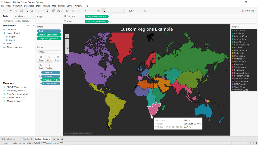
Step 4: Formatting
Here we can edit our Custom Regions map to be a bit more appealing and display more information.
- Drag Continent to the Tooltip mark
- Add the Average for GDP (PPP) per capita to the maps tooltip
- Drag GDP (PPP) per capita to the Tooltip mark
- Right-click the SUM(GDP (PPP) per capita) pill in the Marks card
- Highlight Measure(SUM)
- Select Average
- Remove map borders
- Right-click anywhere within the ma
- Select Format…
- Click the Pane drop-down menu for Row Divider
- Select None
- Click the Pane drop-down menu for Column Divider
- Select None
- Close the Format Borders pane.
- Change map background to Dark
- Click Map from the main menu bar
- Highlight Background Maps
- Select Dark
- Match Worksheets background to your maps ocean water’s colour
- Click Format from the main menu bar
- Click the drop-down menu for Worksheet under the category Default
- Click More Colors…
- Click Pick Screen Color
- Click anywhere within the maps ocean
- Click OK
- Close the Format Shading pane
- Edit the Title to say Custom Regions Example
- Double-click the Title
- Type Example
- Highlight all the text
- Increase Font-size to 20
- Bold the text
- Center Align the text
- Click OK
- Change the Colour palette to Hue Circle
- Click on the Color mark
- Select Edit Colors…
- Select Hue Circle from the Select Color Palette: drop-down menu
- Click Assign Palette
- Click OK
- Add a Dollar Sign ($) in front of GDP (PPP) per capita in the Tooltip
- Click the Tooltip mark
- Click right infront of <AVG(GDP (PPP) per capita)>
- Change font color to Black
- Type $
- Click OK
Please follow me on social media:
YouTube
Reddit
Tableau Public Profile
My Personal Blog
JoshuaPaulBarnard.com

Leave a comment