-
Creating Custom Regions with Large Data Sets – Tableau Prep Example #1
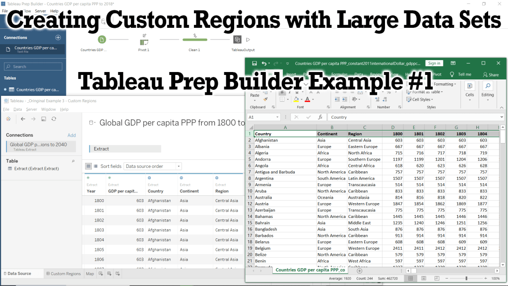
In this Tutorial we will be preparing our data using Microsoft Excel and Tableau Prep Builder to create a .hyper data extract which we will use in future Tutorials and Examples. Tableau has a powerful built-in mapping system that is able to map information down to the zip-code and counties of most countries, but does not have a built-in method of creating our own custom regions (or territories). To do this, we must create a group by coding the custom region into our data as a variable for Tableau to place a country (or state/province) within your custom region. In this example, we will add a Continent and Region variable to our dataset which will create two new groupings and allow us to analyze and visualize our data based on our new groups.
This example was made using Tableau Prep Builder 2020.1 and Microsoft Excel 2019.
If you do not have access to a copy of Excel, then I recommend using Google Sheets in its place.You can view the Video of this walk-through here, but I recommend reading through the steps first before watching the video guide.
In our example we will be using data from Gapminder.org, and you can download the data here.
Step 1: Initial Preparation with Excel
In order to create your own custom regions in tableau, you must add the custom region to every single row of data. To do demonstrate how to do this, we will be using a dataset from Gapminder.org containing information on the GDP (PPP) per capita (in 2011 Int$) from 1800 to 2018 (with projections to 2040). This dataset is perfect for this example, as it is initially structured in a way which is easy for us to edit, but must be pivoted to work in Tableau.
If you are working with a large dataset that is already structured in a way that is usable with Tableau, then you will have to skip to Step 2 and first pivot your data, then return here to Step 1 and continue as normal.
- Open gdppc_cppp-by-gapminder.xlsx in Excel
- Optional: Download gdppc_cppp-by-gapminder.xlsx
- Open Excel.
- Click Open.
- Click Browse.
- Navigate to your file’s location.
- Select gdppc_cppp-by-gapminder.xlsx
- Click Open.
- Optional: Enable Editing
- Find the yellow warning bar undernearth the menu bar.
- Click Enable Editing
- Save countries_and_territories as .csv
- Right-click the countries_and_territories sheet in the bottom left corner of the window
- Select Move or Copy…
- Choose (new book) from the To Book drop-down menu
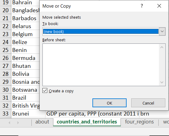
- Click the check-box next to Create a copy
- Save As Custom Regions Tableau Example.csv
- Click File from the menu bar
- Select Save As
- Click Browse
- Navigate to your projects location
- Type Custom Regions Tableau Example for the File name
- Choose CSV (MS-DOS) for the Save as type
- Click Save
- Note: gdppc_cppp-by-gapminder.xlsx is still open in the background and I recommend closing it to prevent confusion.
- Save As Custom Regions Tableau Example.csv
- Adding our custom regions to the dataset
- Normally you would have to manually input the Continent and Region for each country, but I have already done this for us.
- Download List of every Country with Continent and Region.csv
- Open List of every Country with Continent and Region.csv in Excel
- Highlight Columns A, B & C
- Click and hold on the A column header (above the country in cell A1) to highlight the entire column
- Then move your cursor over to the C column header (above region in cell C1) to highlight everything in Columns A through C.
- Copy Columns A, B, & C
- Either press Copy from the Home ribbon
- Or press Ctrl+C on windows, cmd+C on macs.
- Return to your Custom Regions Tableau Example.csv
- Right-click on the A column header (above Country in cell A1)
- Select Insert Copied Cells
- Highlight Columns D, E, F, & G
- Right-click on the D column header
- Select Delete
- Save your workbook
- Close Excel

Step 2: Pivoting our data in Tableau Prep Builder
If we were to go straight into Tableau Desktop from here, then you see over 200 variables with headers such as F126 or 1856. This is because the data is currently structured “long” or horizontal, but we need the data structed “tall” or vertical for our analysis in Tableau. To achieve this we need to transform our data so that each column contains information on just 1 type of data (such as year and gdp). We will utilize another program in the Tableau workspace called Tableau Prep Builder to pivot our data and transform it into a format that Tableau Desktop can read and interpret.
- Connect to Custom Regions Tableau Example.csv
- Optional: Download Custom Regions Tableau Example.csv
- Open Tableau Prep Builder
- Click on the white + next to connections
- Select Text file (under Connect To a file)
- Select First line contains header under Text Options
- Save as Custom Regions Tableau Example
- Create a new Pivot step in the workflow
- Click the + next to Custom Region… in the workflow view
- Select Pivot
- Add 1800 through 2040 to the Pivoted Fields section
- Click on 1800 under Fields
- Hold down shift and click on 2040
- Click and hold any of the highlighted fields
- Drag them to the Pivoted Fields section
- Create a new Clean Step from Pivot 1
- Rename Pivot1 Names to Year
- Right-click on the Pivot1 Names card (above 1800)
- Select Rename Field
- Type Year
- Press Enter
- Rename Pivot1 Values to GDP (PPP) per capita ($)
- Remove null Country entries
- Right-click null in the Country card
- Select Exclude
- Create an Output step
- Change output type to Tableau Data Extract (.hyper)
- Save as Custom Regions Tableau Example.hyper
- Click Browse, under Save output to file
- Navigate to your projects folder location
- Type Custom Regions Tableau Example for the File name
- Click Accept
- Run All Flows
- Click Run Flow from the output pane
- Click the Run all flows button that looks like an arrow head pointing right above the view.
- Click Flow from the menu bar then select Run All
- Press Ctrl+R
Congratulations!! You have just added custom regions to your data with Excel and used Prep to transform your data into a usable format! Now that you have completed these steps, you can now move on to my Tableau Example #3 – Custom Regions and use our new dataset to create data visualizations that can show us information on a per country, per region, and per continent view.

Please follow me on social media:
YouTube
Reddit
Tableau Public Profile
My Personal Blog
JoshuaPaulBarnard.com - Open gdppc_cppp-by-gapminder.xlsx in Excel
-
Dashboard of the Failed Banks in the USA from 2000 to 2019 (My First Tableau Dashboard!)
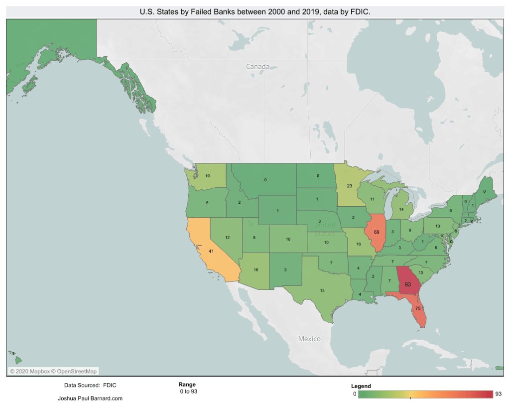
This is my first Tableau Dashboard from back in January 2020. I used data from the FDIC’s list of failed banks which can be found here:
https://catalog.data.gov/dataset/fdic-failed-bank-listPlease follow me on social media:
YouTube
Reddit
Tableau Public Profile
My Personal Blog
JoshuaPaulBarnard.com -
Tableau eLearning Offers 90 Days Free During COVID-19 Outbreak

Tableau is offering their entire official learning course on eLearning for 90 days for free!
While their certificate exams are down due to a lack of text proctors, they are offering the Tableau Desktop Specialist Certification for for only half off, only $50! (until June 30th, 2020)To get 90 days free, follow these steps:
- Go to https://elearning.tableau.com
- Create a (or Sign-In to your) TableauID account.
- Enter access code 2020elearning,
- Read and acknowledge the Terms & Conditions
- Click Continue
Start learning Tableau during your new free time! https://www.tableau.com/learn/training/elearning
-
Distribution Map – Tableau Example #2
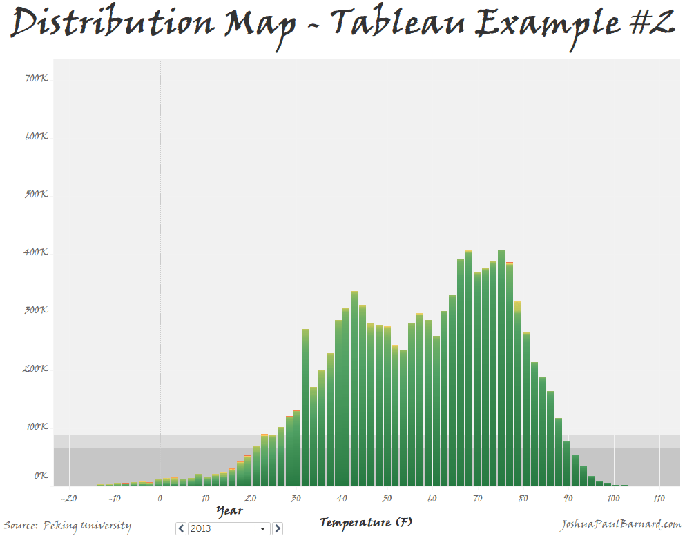
This fun little visualization is the first chart that I genuinely discovered on my own, allowing us to graph the distribution of a single measure or of two measures compared to each other, and then adjust the colors within the distribution graph. That is because it is actually made up from an accumulation of squares, which can have dynamic color schemes added to them. You can also use this visualization to easily filter and page through your data to view a breakdown of your distributions. To make this visualization, we will be making a bar chart using a single measure, then expanding to using two measures, then paging our data by year using the date dimension.
You can view the Video of this walk-through, but I recommend reading through the steps first before watching the video guide.
In our example we will be using data from Peking University on PM2.5 concentrations in the air of 5 major Chinese cities from 2012 to 2015.
The original data comes from Song Xi Chen at Peking University
This example was made using Tableau Desktop 2020.1
Step 1: Initial Setup
First things first we will connect to our data, create our worksheets and save the Tableau workbook as Distribution Map Example
- Connect to “PM2_5 from 5 Chinese Cities from 2012 to 2015.csv”
- Open Tableau Desktop
- Select Text File
- Navigate to your files location
- Select PM2_5 from 5 Chinese Cities from 2012 to 2015.csv
- Rename Sheet 1 to Single Measure
- Right-click the Sheet 1 worksheet tab in the bottom left corner of the screen
- Select Rename
- Type Single Measure
- Press the Enter key
- Create a new blank worksheet and rename it to Two Measures
- Click Worksheet in the menu bar
- Select New Worksheet
- Right-click the Sheet 2 worksheet tab in the bottom left corner of the screen
- Rename Sheet 2 to Two Measures
- Press the Enter key
- Make the Single Measure worksheet active
- Click the Single Measure worksheet tab in the bottom left corner of the screen
- Save your workbook as Distribution Map Example
- Click File in the menu bar
- Select Save As…
- Type Distribution Map Example
- Navigate to where you want to save the project
- Click Save

Step 2: Creating Single Measure Distribution Map
We will now create our first distribution map using a single variable. For comparison, create a bin of size 27 from the PM2.5 concentration (ug/m^3) measure and place it in the columns instead.
- Drag PM2.5 concentration (ug/m^3) over to Rows.
- Drag PM2.5 concentration (ug/m^3) over to Columns.
- Turn off Aggregate Measures
- Click Analysis in the menu bar
- Select Aggregate Measures
- Change the Marks type to Bar
- Locate the Marks card
- Click the drop-down menu at the top of the Marks card (it should say Automatic)
- Select Bar
Congratulations! You have just made a Distribution Map for a single variable.

Step 3: Creating Distribution Map Comparing Two Measures
Now we can use the same basic method to create our chart comparing the distribution between two different measures. As you may have noticed by now, the real magic here lies in not aggregating our measures, so we are comparing each individual data point to each other.
- Drag PM2.5 concentration (ug/m^3) over to Rows.
- Drag Temperature (Fahrenheit) over to Columns.
- Turn off Aggregate Measures
- Click Analysis in the menu bar
- Select Aggregate Measures
- Change the Marks type to Bar
- Locate the Marks card
- Click the drop-down menu at the top of the Marks card (it should say Automatic)
- Select Bar
Congratulations! You have just made a Distribution Map for comparing two measures.

Step 4: Paging and Formatting
Now that we have created our distribution maps, we will now look into colouring them then paging through the data by a Dimension field. In this example our dynamic colouring will be purely for aesthetics, but this feature can be used to help highlight extremes in the distribution. Paging by a dimension such as date allows us to make sure that the distribution for each group which we are analyzing has a proper distribution.
- Drag PM2.5 concentration (ug/m^3) over to the Color mark.
- Change the color scheme of the chart to Red-Green-Gold Diverging reversed.
- Click the Color mark
- Select Edit Colors…
- Click the drop-down menu under Pallette:
- Choose Red-Green-Gold Diverging
- Select Reversed
- Click OK
- Drag Date from Dimensions to the Pages card.
- Change Worksheet Title to Distribution Map Example.
- Right click the current Title (it should say: Two Measures – 2012)
- Select Edit Title…
- Clear the current text
- Turn on Bold
- Center Align Text
- Type: Distribution Map Example
Congratulations! You have just formatted your new Distribution Map and can now page it by year!
You can check out how I used this example in a working dashboard about the PM2.5 Concentrations across 5 Chinese Cities from 2012 to 2015.

Please follow me on social media:
YouTube
Reddit
Tableau Public Profile
My Personal Blog
JoshuaPaulBarnard.com - Connect to “PM2_5 from 5 Chinese Cities from 2012 to 2015.csv”
-
Visualizations within a Tooltip – Tableau Example #1
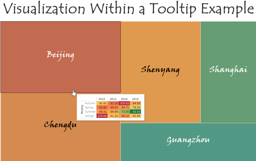
Visualizations within a tooltip are a great way to display information that is not already available on your chart. One of the great things about tooltip visualizations is that they change the information they show based on what you hovering over. This will become more apparent in the end, when we are able to move our cursor over a group in the treemap and see yearly information for just that group. In this example we will be creating our own highlight table and treemap charts, then adding the highlight table as the charts tooltip.
Please check out the Video of this Walk-Through
You can view the finished example on my tableau public account
This example was made using Tableau Desktop 2020.1
This data comes from Song Xi Chen at Peking University
You can download a copy of the data used in this example here
Step 1: Initial Setup
We will be using data about air pollution in 5 major Chinese cities from 2012 to 2015.
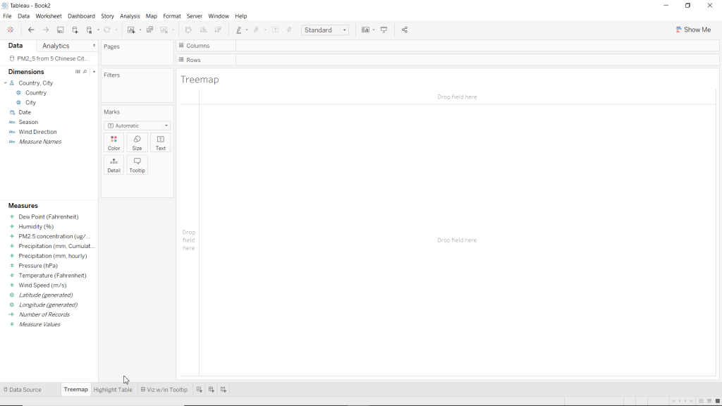
- Open Tableau Desktop
- Connect to “PM2_5 from 5 Chinese Cities from 2012 to 2015.csv”
- Rename Sheet 1 to Treemap
- Create a new blank worksheet
- Rename Sheet 2 to Highlight Table
- Save your workbook as Visualization within Tooltip Example
*Note: Please excuse the dashboard in this screenshot, it is from a rough draft of this blog post.
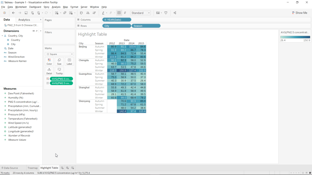
Step 2: Create Highlight Table
Our highlight table is what we will use as our visualization within the tooltip. Granted, these are not cool distributions or charts, but remember that the main purpose for adding visualizations within tooltips is to provide your clients with additional information that they are not already receiving from the chart on its own.
- Go to the Highlight Table worksheet
- Drag PM2.5 concentration (ug/m^3) over to the Color mark.
- Change the color of PM2.5 concentration (ug/m^3) from sum to average
- Right click the SUM(PM2.5 concentration (ug/m^3)) pill in the Marks card
- Highlight Measure (Sum)
- Select Average
- Drag PM2.5 concentration (ug/m^3) over to the Label mark.
- Change the label of PM2.5 concentration (ug/m^3) from sum to average
- Right click the SUM(PM2.5 concentration (ug/m^3)) pill in the Marks card
- Highlight Measure (Sum)
- Select Average
- Drag Date to Columns
- Drag City to Rows
- Drag Season to Rows
- Change the Marks type to Square
- Locate the Marks card
- Click the drop-down menu at the top of the Marks card (it should say Automatic)
- Select Square
Congrats, you have just created a Highlight Table without using the Show Me menu!
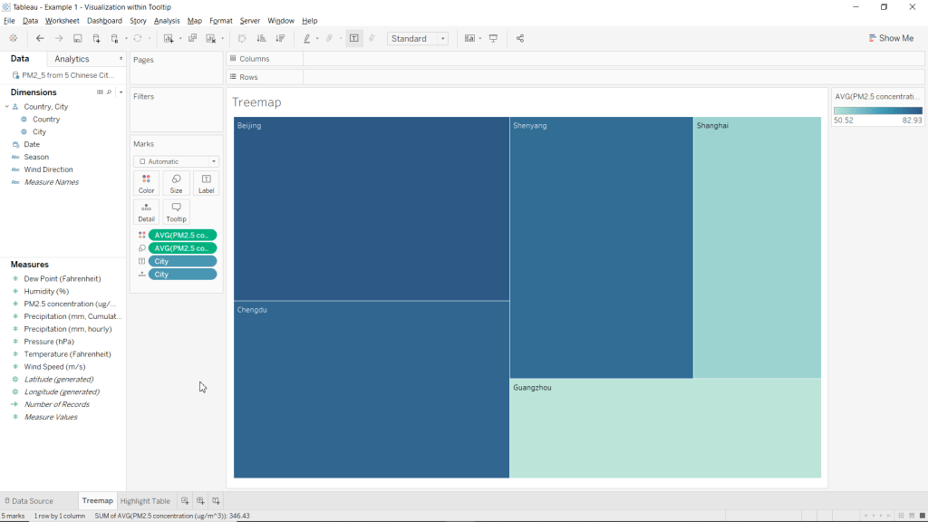
Step 3: Create Treemap Chart
You can use visualizations within tooltips on any chart you want, with whatever charts or tables you want. For this example, we will be demonstrating this cool feature in Tableau using a treemap chart.
Congratulations, you have just created a Treemap Chart without using the Show Me menu!
Step 4: Adding the Visualization to the Charts Tooltip
Now that we have created our data visualization (treemap) and additional information to display (highlight table) we are now ready to bring it all together and add the table to our charts tooltip.
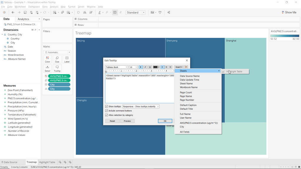
- Click the Tooltip mark
- Clear the text
- Insert a sheet into your tooltip
- Click Insert (in the top-right corner of the Edit Tooltip window
- Highlight Sheets
- Select Highlight Table
- Click OK
Congrats, you have just added a visualization to your charts tooltip! Now when you hover over (or select) any of the sections of the treemap, you will see information about that city in the tooltip from the highlight table!
Step 5: Formatting
At this point you have accomplished your initial goal, but the default colour scheme just leaves something to be desired. From here everything is optional, but I will show you how to format your chart to look similar to my example.
- Go to the Highlight Table worksheet
- Hide the Title
- Right-click on Highlight Table in the top left corner of the worksheet
- Select Hide Title
- Hide Date column header
- Right click Date (above 2013 and 2014 in the worksheet view)
- Select Hide Field Labels for Columns

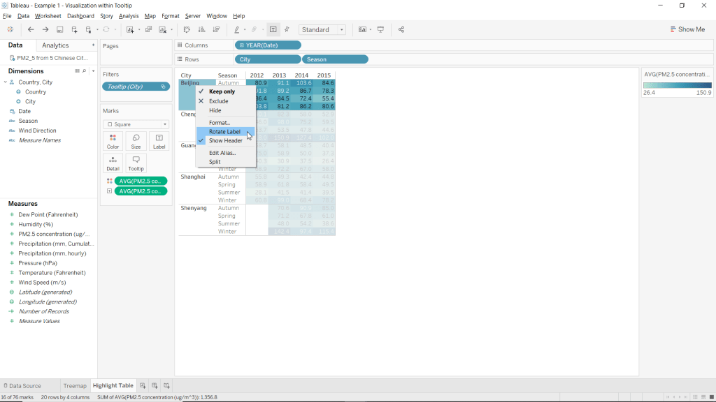
- Rotate City labels
- Right-click anywhere below City (in the table)
- Select Rotate Label
- Change the color scheme of the chart to Red-Green-Gold Diverging reversed.
- Click the Color mark
- Select Edit Colors…
- Click the drop-down menu under Pallette:
- Choose Red-Green-Gold Diverging
- Select Reversed
- Click OK

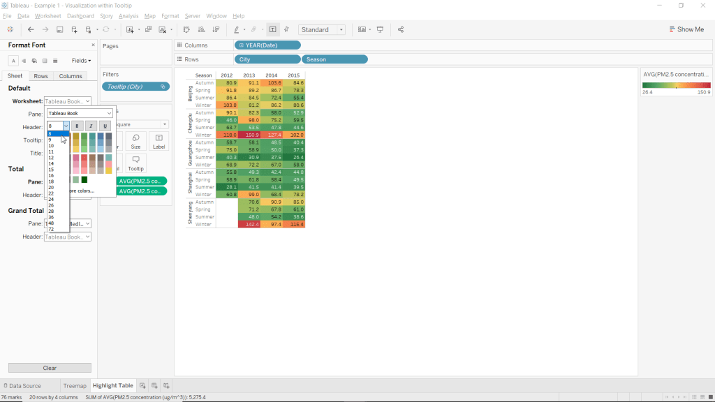
- Change the worksheets font-size to 8.
- Right-click on any of the cells within the table (below the dates and right of cities/season)
- Select Format
- Click the drop-down menu next to Worksheet:
- Click the drop-down menu for font-size (should be a 9 by default)
- Select 8.
- Close the Format pane.
- Manually adjust the tables column width to be as small as possible.
- Position your cursor inbetween the cells for each individual year until your cusor becomes a horizontal double-arrow. Such as in the picture below
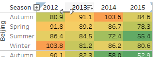
- Remove extra blank space from each column by clicking, holding, and moving the cursor left.
- Position your cursor on the line between seasons and the tables data until your cursor becomes a horizontal double-arrow.
- Remove extra whitespace from the seasons column
- Note: This step is to allow this table to fit within the tooltip of your chart.
- Go to the Treemap worksheet
- Change the color scheme of the chart to Temperature Diverging reversed.
- Click the Color mark
- Select Edit Colors…
- Click the drop-down menu under Pallette:
- Choose Temperature Diverging
- Click OK
- Change Font to Viner Hand ITC
- Set Font-size to 28
- Set Charts text alignment to be middle center.
- Click the Label mark
- Use the drop-down menu next to Font: to change the font and size.
- Use the drop-down menu next to Alignment: to change the vertical and horizontal alignments to Center.

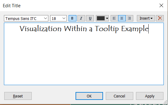
- Set the Title text to “Visualization Within a Tooltip Example”.
- Set Title Font to Tempus Sans ITC.
- Set Title Font-Size to 18.
- Bold the Titles text.
- Center Align the Titles text.
- Right click the title
- Select Edit Title…
Congratulations!! You have just added a visualization to your charts tooltip! Now when you hover over (or select) any of the sections of the treemap, you will see information about that city in the tooltip from the highlight table!
You can view this example in a working dashboard I made about the PM2.5 Concentrations across 5 Chinese Cities from 2012 to 2015
Please follow me on social media:YouTube
Reddit
Tableau Public Profile
My Personal Blog
JoshuaPaulBarnard.com
-
Subscribe
Subscribed
Already have a WordPress.com account? Log in now.
