-
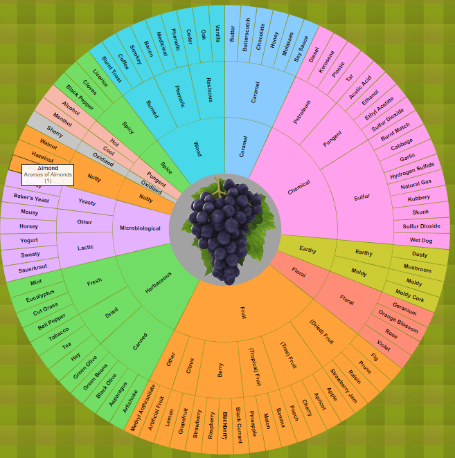
Interactive Wine Aroma Wheel
https://github.com/JoshuaPaulBarnard/Interactive_Wine_Aroma_Wheel An Interactive Wine Aroma Wheel based on the Davis Wine Wheel by A.C. Noble. This is a zoomable and partitioned sunburst chart made using the D3.js v3 JavaScript Library. Clicking on the partitions will zoom-in on to that segment, with sub-categories radiating out. “The Davis Wine Aroma Wheel is divided into several sections to…
-
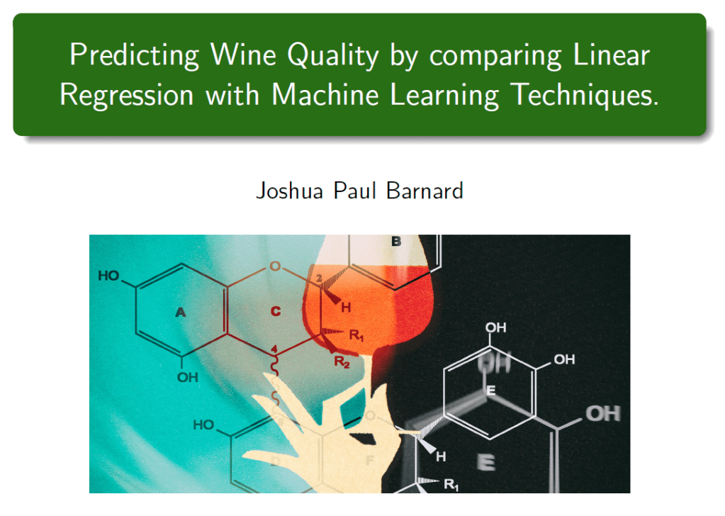
Predicting Wine Quality
Predicting Wine Quality by comparing Linear Regression with Machine Learning techniques. Comparing Linear Regression with kNN, Decision Tree and Random Forest with Bayesian Inference to Predict Wine Quality in Python. We use python and Jupyter Notebook to download, extract, transform and analyze data about the physicochemical properties which make up wine, and use them to…
-
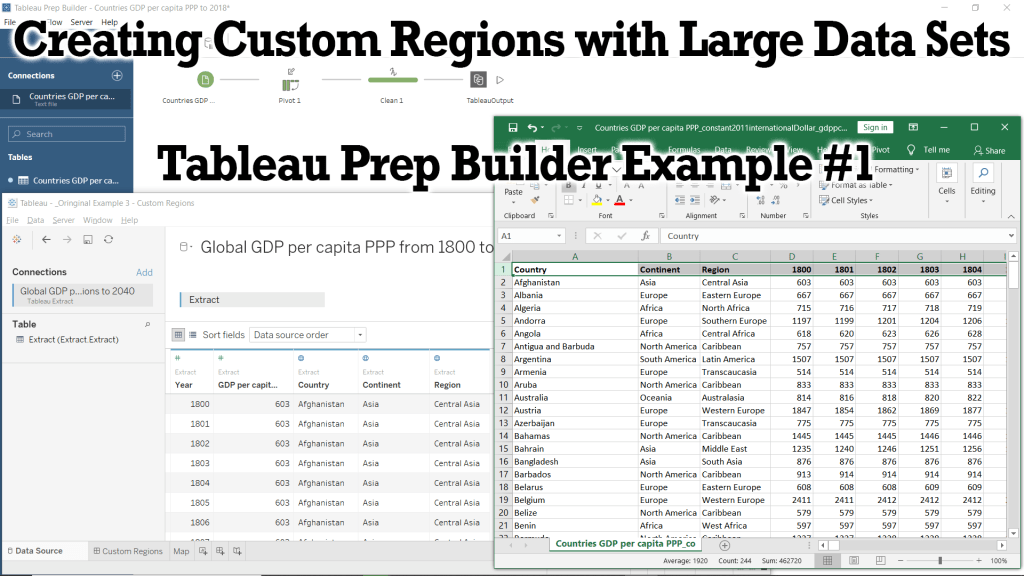
Creating Custom Regions with Large Data Sets – Tableau Prep Example #1
Tableau Tutorial for preparing our data using Microsoft Excel and Tableau Prep Builder to create a .hyper data extract. We will code our data to include continents and a custom region to each country which we will use in future Tutorials and Examples.
-

Tableau eLearning Offers 90 Days Free During COVID-19 Outbreak
Tableau is offering their entire official learning course on eLearning for 90 days for free!
-
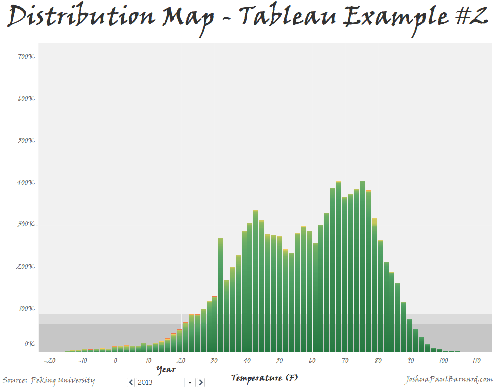
Distribution Map – Tableau Example #2
This fun little visualization allowS us to graph the distribution of a single measure or of two measures compared to each other, and then adjust the colors within the distribution graph. You can also use this visualization to easily filter and page through your data to view a breakdown of your distributions.
-
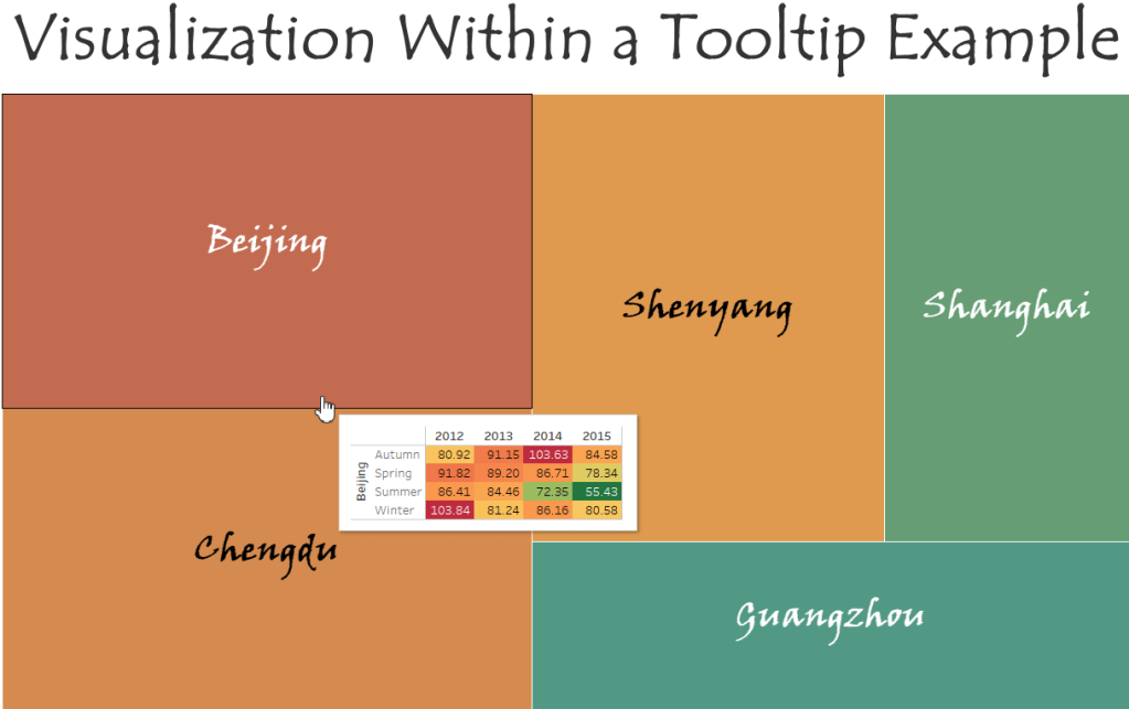
Visualizations within a Tooltip – Tableau Example #1
A step-by-step walk-through of how to add visualizations into chart tooltips.
-
Subscribe
Subscribed
Already have a WordPress.com account? Log in now.
