-
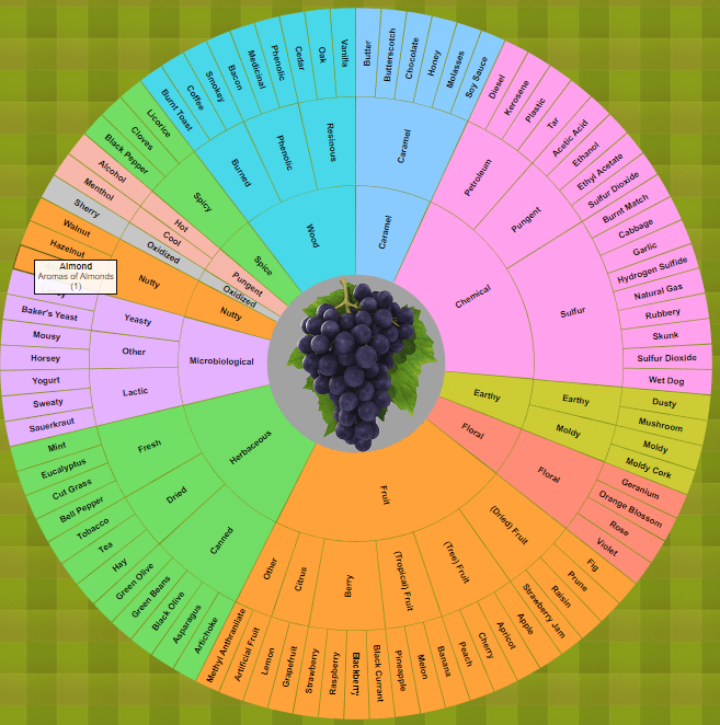
Interactive Wine Aroma Wheel
https://github.com/JoshuaPaulBarnard/Interactive_Wine_Aroma_Wheel An Interactive Wine Aroma Wheel based on the Davis Wine Wheel by A.C. Noble. This is a zoomable and partitioned sunburst chart made using the D3.js v3 JavaScript Library. Clicking on the partitions will zoom-in on to that segment, with sub-categories radiating out. “The Davis Wine Aroma Wheel is divided into several sections to…
-
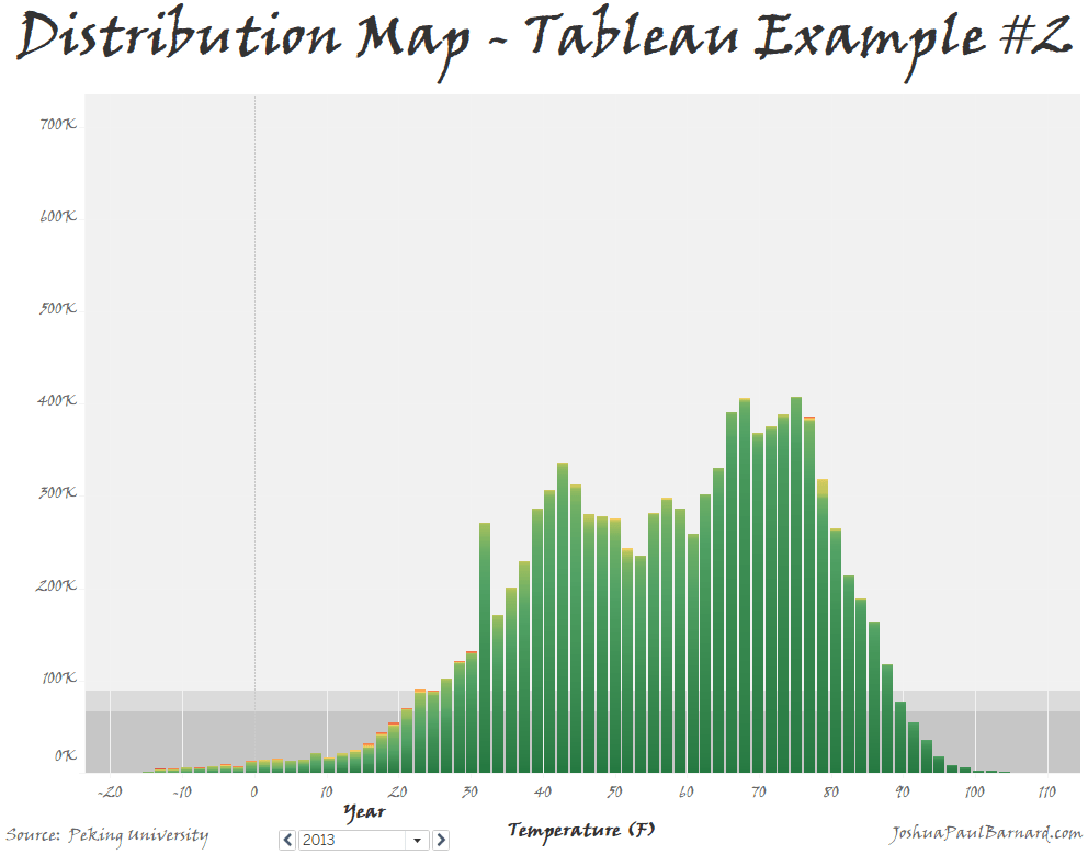
Distribution Map – Tableau Example #2
This fun little visualization allowS us to graph the distribution of a single measure or of two measures compared to each other, and then adjust the colors within the distribution graph. You can also use this visualization to easily filter and page through your data to view a breakdown of your distributions.
-
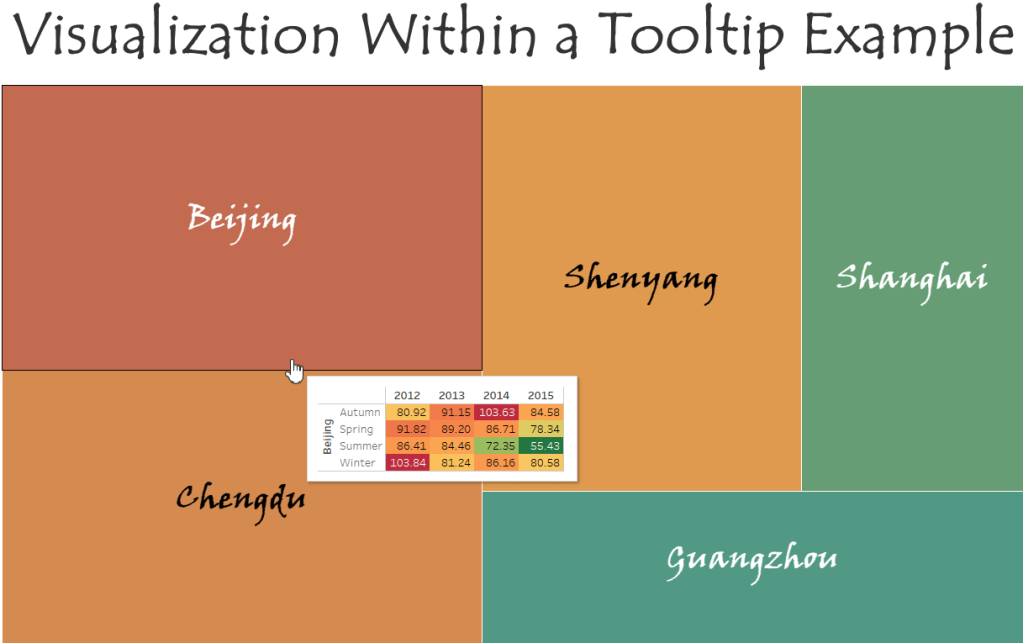
Visualizations within a Tooltip – Tableau Example #1
A step-by-step walk-through of how to add visualizations into chart tooltips.
-
Subscribe
Subscribed
Already have a WordPress.com account? Log in now.
